Feature
What 'Persona 5' Can Teach Us About Style, Flair and Art Direction
Persona 5 does not win on raw graphics. It wins because its art style never switches off, from the first battle to the last equipment menu.
This piece stays clear of Persona 5’s story. Everything below is about how the game looks and moves, which is reason enough to talk about it.
Anyone who has spent time in Atlus’s Metaverse with the Phantom Thieves tends to say the same thing first: the game has flair. Persona 5 tells one of the strongest stories in the series, but its bigger leap is in style. It moves further from its predecessors, and from most JRPGs, than anything the series had done before.
Where Persona 5’s art style comes from
The Persona 5 art style sits on the border between anime and manga, the graphic novel, and the Western comic book, and it blends all three without visible seams. Plenty of games, many of them from Japanese studios, borrow from one or two of those traditions. Few manage a hybrid this coherent.
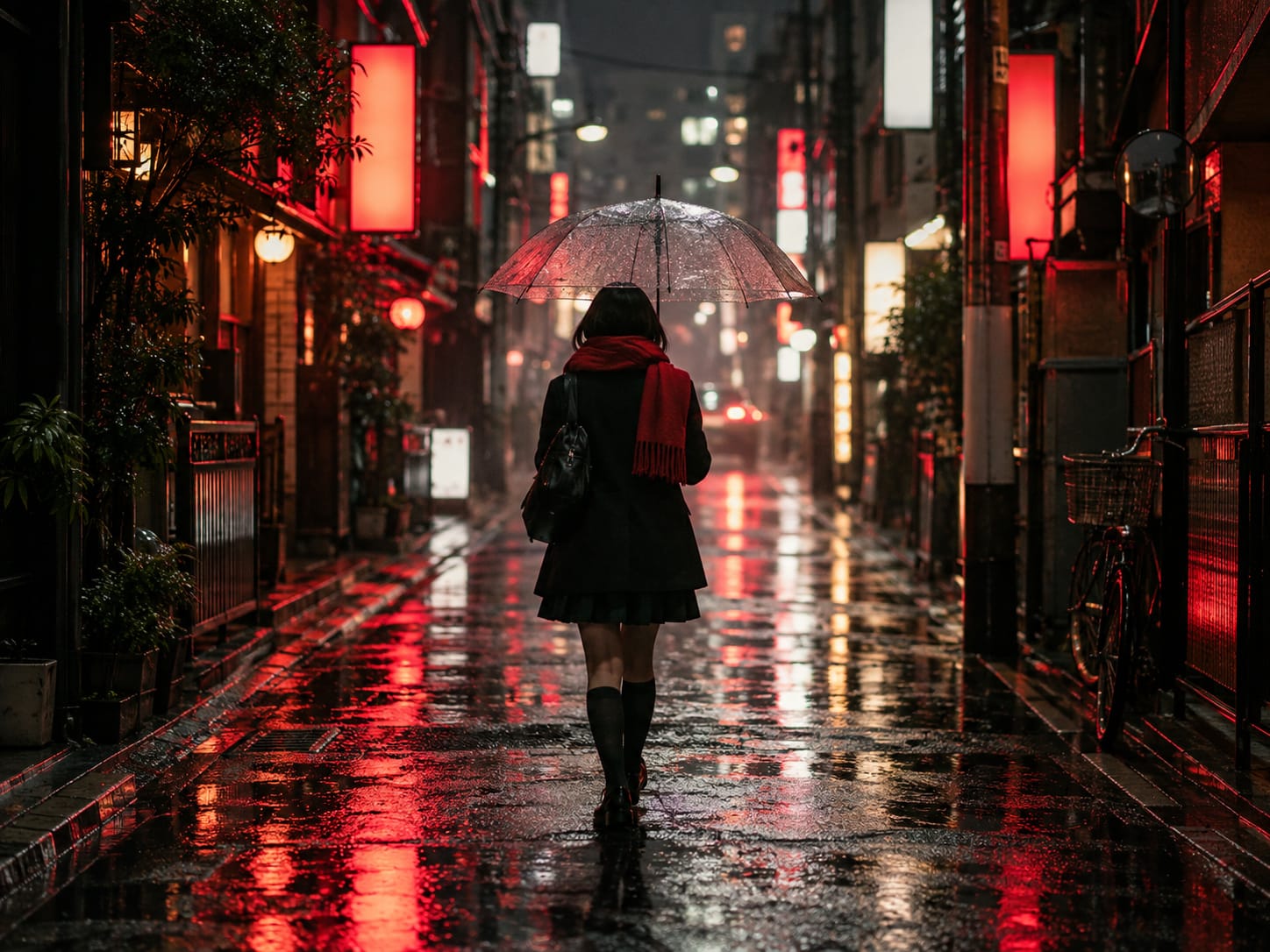
At times the look recalls Frank Miller’s Sin City: splashes of saturated red over deep black and grayscale. The red, black and white palette is so consistent that a single screenshot is enough to recognise the game. The attitude also suggests Grasshopper Manufacture and Suda51, with traces of Killer7, No More Heroes and the loud colour of Lollipop Chainsaw.
Whether Atlus deliberately studied Suda51 is impossible to say from the outside. Influence rarely works so directly. What is clear is that the team drew on the strongest motifs of graphic novels, comics and anime, and gave them a voice of its own.
Flair that never switches off
The series has always had style. Persona 3 and Persona 4 built the brand on bright colour and attitude, but the PlayStation 2 limited them. Their dungeons repeated textures and layouts, so most of the flair lived in battles, cutscenes and the usual fanfare. Persona 4’s strengths, its characters and its sense of style, are visible in Persona 5, which simply spreads them everywhere.
That is the key point. Style limited to one part of a game feels like a costume. Persona 5 applies its look to battles, area transitions and menus alike.
The HUD, both in free exploration and in battle, looks torn from a comic panel, with jagged headers and sharp colours slashed across the screen. The transitions in and out of combat are among the most stylish ever made for a JRPG. The results screen showing experience and loot is the best example: the camera follows the protagonist as he breaks from one frame to the next and steps straight back into the dungeon, almost breaking the fourth wall. The menu does not interrupt play here. It is part of the performance.
The menus are part of the show
Every JRPG sends its players into menus constantly: comparing characters, fusing Personas, checking stats before an infiltration. Persona 5 makes those menus pleasant to look at. The Velvet Room and the equipment screens are as carefully designed as the battle animations.
This is where the lesson for other developers lies. Discussion of game visuals tends to focus on fidelity: does it run at 1080p and 60 frames per second? That matters, and a crisp image is welcome. “Does it look good?” is a different question, and the answer often depends on elements that rarely get attention, such as the HUD, the battle menu and the loading transitions.
Space as well as style
The jump to PlayStation 4 helps in other ways. Persona 5 is much easier to move through than earlier entries, and its dungeons are properly three-dimensional. Players get viewpoints the older games could not offer, and Atlus gets room to show how far its art direction has come.
None of this criticises other JRPGs for skipping the effort. Many look superb in their own way. Persona 5’s achievement is that it carries its style into every interaction until it stops feeling like decoration. That turns a very good game into an outstanding one.
What other games can take from it
Persona 5 shows that a long-running, acclaimed series can still break its own moulds. Atlus did not need cutting-edge hardware. It needed a clear idea of how the game should feel, and the discipline to apply it to a stats screen as carefully as to a boss fight.
Watch the protagonist leave a finished battle once more: he steps out of the results panel, through the frame, and back into the corridor without a single loading screen.